As a man thinketh in his heart; so is he. Proverbs 23:7

"Rejoice in the Lord alway: [and] again I say, Rejoice.

Let your moderation be known unto all men. The Lord [is] at hand.
Be careful for nothing; but in every thing by prayer and supplication with thanksgiving let your requests be made known unto God. And the peace of God, which passeth all understanding, shall keep your hearts and minds through Christ Jesus. Finally, brethren, whatsoever things are true, whatsoever things [are] honest, whatsoever things [are] just, whatsoever things [are] pure, whatsoever things [are] lovely, whatsoever things [are] of good report; if [there be] any virtue, and if [there be] any praise, think on these things. " -Philippians 4:4-9


Sunday, March 16, 2008

Line Drawing of Times Square


While in New York, I drew this from my hotel window. Times Square NYC. Felt tip pen, 9x12 sketchbook 400 series Strathmore.

Machine Made versus Hand Made


This is a close-up detail of an appliqued coverlet commissioned in 1937 ... to be made as a matching pair of twin bed appliqued coverlets which is quite an ambitious project that takes months to complete. These are heirloom quality by today's standards because they have handmade 12-to-the-inch stitches and the precision of the parallel quilting is wonderful and difficult. They have intrinsically value, at least to me. No one does this any more by hand that I know of.

A seamstress today could recreate this same art work with a machine and it would be made with even smaller stitches with more perfection, and completed in a fraction of the time with relatively little skill requirement on the part of the seamstress but would it have the same intrinsic value as these handmade ones?

I rather doubt it. Why is that, if the machine made ones are more perfect with even smaller stitches?

It must be the human factor of imperfection.

The best digital images ... no matter how spectacular ... just do not move me as a handmade one does. They are just too perfect. I have the same reaction to retouched photos of famous people or models on magazine covers. It is all so phony and plastic.

Honestly, I would not buy a digital image, frame it, and hang it in my home. I'm not being a snob. It just doesn't say "human workmanship" to me and so it has less intrinsic value. I would value an oil portrait over a photo portrait. Why is that? The photo has to be more accurate.

I've thought about this a lot lately and wondered if I am just resisting change. I don't think so. The too perfect images feel inhuman.

When I have had to create digital images in the past it seemed always a fight to make the image the way I wanted, and there is always the temptation to do things the way the computer wants to do it. Usually it seems that the computer wins because it's tools always render more perfectly than I and that is not satisfying to me as an artist.

To be sure there is a market for digital art, and it will probably grow but it is not for me.

I say, why not just pick up a brush and paint the image? My image will represent the time I have invested to develop my skills, and my imperfections in the painting will be identifiable that it was indeed handmade.

Friday, March 7, 2008

Current Art Work - In Progress


WIP 8x10 oil sketch on canvas board. I hope to do this for mself on on large canvas as soon as I work all the kinks out.  

The picture (face soon to be added when it is dryer) is of son, Darren when he was a little kid and the silver baby cup a family heirloom (Poppie's), and the teddy bear is just there to introduce the magic of "make-believe" associated with childhood; the red background is there to give the feeling of childhood should be like ... full of energy and joy.  I think Darren's childhood was like that.

Here is aWC pencil sketch of Darren, now a fully grown man from a snap shot.  Watercolor pencil 5x8 Heavy WC paper.

Photobucket
Brenden from photo. Watercolor pencil 5x8.
Photobucket

Still working on eggs .... the setup needs something I think.  I wanted to project the simplicity and perfection of form; how something so small and insignificant could bring such great culinary delights to the planet; how it is so strong as a binder for "egg tempera" (it makes a paint film that is strong as iron) and an essential ingredient in many art masterpieces that the world cherishes; how it is used in the drug industry to make life saving antibiotics; how it can produce the little chick who feeds literally the whole world. Something to think about.   I need to find a way to create a visual image...  "In Praise of the Egg." 


Tuesday, February 26, 2008

OKC Museum of Art - Paris 1900 Exhibit


Here is a drawing (below) as a study I did after a beautiful litho poster (at left) by one of the great artists of this time. To appreciate these giant posters and the artists who created them, one needs, really, to have done some lithography. 

An image is drawn upon giant five inch thick stone slabs ... yes stone slabs ... that have been polished silky smooth. (These are very special stones quarried and sawn into flat slabs upon which images are printing.)  The surface is "opened" with acid and the artist then draws the image on with either wax litho pencils or painted with a thick masking litho ink to make a resist; then the stone is closed causing the background to resist ink and remain "white" or "closed" during printing ... meaning that it repels ink and keeps the area from taking ink. The drawn area is inked with and the edition is pulled.  Paper is dried and re-moistened and the next color pass is made. Therefore every color requires a different stone slab very similar to modern 4-color separations. (My prints were only done in black ink so I can just imagine.)

The stone and paper are run thru a printing press for each color. To make an edition is no small task for all of the color must register perfectly in every color pass and be printed evenly throughout the run.   It's a big difficult chore.  

This Paris 1900 Exhibit is, unfortunately over but you can find current exhibits at this link:
http://www.okcmoa.com/exhibitions/currentexhibitions

I enjoyed the exhibit. Having done lithographs, I appreciated what went into those monumental posters. I love art nouveau and the decorative work from that period.

Here are more drawing from my sketch book (I always do this because it helps my recall) of the other art work on exhibit that I .  

museum sketches
dragon ern
Sketches  OKM of Art Exhibit

Sunday, February 24, 2008

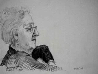
Mother

Mom
This is my beloved mother...a sketch done without her knowing while she was watching TV at my home. I didn't capture her essence for she is truly a matriarch and a lady in every way and I don't think this sketch does her justice and I will try again another time.

Edith is the kind of loving mother all children desperately need and want. She is full of love and affection and dubbed the "hugger" at church. She is modest, has no tattoos, or body piercing except for her earrings, is disciplined, and yet she is the most "with it," knowledgeable ... the most beautiful woman inside and out ... without a trace of vanity .... that I have ever known. Yet she is a very feisty woman, not perfect but pretty close. There is a spiritual depth and steadiness in her that draws people by the droves to her for advice even at the age of 88.

Is this a fading image of motherhood and feminine beauty?

I wonder what tomorrow's mother will be like? Somehow modesty and virtue is so out of vogue to the majority of young women (if the images on television are a correct reflection, and if what I see by personal experience in my own little world is any measure) how on earth will our children grow to have any character or spirituality. Mothers are not suppose to be your drinkin' buddies.

It seems to me, the American television-Hollywierd image of woman has become so sexualized, immoral, self-absorbed, self-sufficient and very anti-male ... can one not wonder what the next crop of kids will be like?

Isn't this the growing image of today's modern tattooed mother? Look at the image below. Call me a tattooaphobic, I don't care.

Could the ugly tattoo become an accurate and fitting reflection of today's society in history?

I have been in the image business throughout my career. Images are powerful. Businesses spend millions of dollars to create a positive image because they know that the wrong image will drive customers away.

People amuse me LOL. Strong and nasty comments cannot be made funny and positive by merely putting "LOL" after the period; neither will a cute-see image tattooed on an ankle be acceptable because it's cute, or religious neither is it a badge of masculinity. All tattoos scream "in your face rebellion" at me, and it will take a lot to change that negative impression.

For example, this must be a "proud mamma." It's "kitsch" not art and it's taste-less...right there with dime store paintings on black velvet.

Now there are several in my family who have opted to have tattoos...they may not like my honesty. I was hesitant about writing about this for that reason. I love my family dearly and I am thankful that I know all them, I love them unconditionally; however, I am profoundly sad that they made that choice for I fear that it's going to take my generation or more, to die off before it is an acceptable practice in polite upwardly mobile society. I guess that is what makes me so frustrated ... it is because I know how wonderful they are that I hate what that permanent mark might do negatively against them in society especially when they try to get better jobs, etc.

Appearances create image and images speak powerful non-verbal messages. The argument for tattoos and against marriage; it's just ink and it's just paper on a contract. Not good arguments. The Beatle's long shaggy hair...it's just hair they protested...they were right... wasn't permanent and that fad has disappeared along with disco and bell bottoms and I don't think male ponytails are much accepted yet.


Could it be that one girl never had a real mother.

Sunday, February 17, 2008

Double Your Pleasure Double Your Bubble...

This post is inspired by a discussion on Ceninni Forum about favorite bubble gums like Bazooka and Double Bubble Gum...remember those?

As a gum chewing connoisseur...my personal bubble gum favorite is a combination of Wrigley's "green package" Double Mint Gum and Trident Pink Bubblegum.

The green makes the Trident gum more pliable and the bubblegum makes the green more elastic to make a bubble.


Combine these two and you have a perfect bubble gum that won't loose it's flavor on the bedpost over night and won't turn to lead in your mouth...a trait that Bazooka and Double Bubble produce making one's jaw very sore and impossible to produce a bubble of any real size after the sweet taste is gone.

Now this is a real big secret so please do not pass this on.

Sunday, February 10, 2008

Decompressing - Art Boot Camp

SEE SLIDE SHOW
http://s260.photobucket.com/albums/ii3/padurrett/Art%20Boot%20Camp/?action=view¤t=9379f891.pbr


Haverhill, MA - Boot Camp and the Peddler's Daughter Pub...what an experience. Rob Howard and Kurt conducted the camp and concocted still-life setups that would challenge and provide the images to teach a very focused curriculum.

Decompressing, that is what I am doing for the rest of the week. Life presses in as I attended a funeral, planned my daughter's birthday dinner party, dealt with car trouble, and attended a family party for my nephew and his wife who are departing for Washington state to live. All of these activities keeping me from my studio. (A little frustration.)

I came home from Art Boot Camp completely exhausted from four days of painting as fast as I ever have and all these above activities. For all the money I spent on camp no masterpieces were created but I learned so much my brain is hurting: why toning a canvas makes it so much easier to block in the values; how to create strings of values; received an overview of the Munsell Color System - simplified; explored the value and range of a limited palette; an analysis of the composition of light and shadow - clarifying the difference between a "bump" and a prenumbra; and driving home the key to realistic painting -- edges and values.

Grisailles, Glazes and Dappled Light...oh my.

The comradeship of serious artists and the quaintness of a former shoe manufacturing New England town built along side the blackish Merrimac River and the delicious food found in the abundant pubs make the experience truly memorable. (Haverhillians do not sweeten their quite strong tea....oh what they are missing to punch up that very strong tea with a bit of sweet!)

A few random pictures from camp:


The apple was done in graiselle and then glazed.


This was a monchromatic studies to understand
the range of chroma/value according to the
Munsell Color System.


These studies were done on one canvas.


The great thing about camp is that the artists who come here are not only very talented but serious about developing their ability to the maximum. The networking and friendships that are developing as a result of this association is very rewarding in itself.

Saturday, January 19, 2008

Infant Pastel

Newborn Infant Grandchild (click to see the complete picture)Pastel Infant
This is a picture of my friend and neighbor's new grandchild. I saw the image and decided to experiment with pastels. I liked it so I decided to give it to my friend. She and her daughter liked it so I decided to post it here.

Anyhow...I also posted it on the Cennini Forum. I had some positive comments.

I would like to take a course in pastels sometime.

Tuesday, January 15, 2008

Drawings

The following are some tonal studies (about 8x10) from photos of great masterpieces printed in a book of about the same size. I did these to work on the five tonal ranges: Highlight, Halftone, Reflected Light Values, Shadow, Cast Shadow. I also attempted to "see" the expressions and replicate the feeling. Can you guess which drawing was the hardest?
#1copy1
#2copy 2
#3copy3
#4copy 3
#5copy 4
#6copy 5
#7copy 6
#8border="0" alt="Girl In Red Hat after Vermeer">


The fourth one was the hardest. The object was to express the height of femininity. All the edges were soft except for a very few. It took me many hours to draw this one. The last one number eight was also difficult because Vermeer is so complex and without color chroma, it was almost impossible to provide the punch it needed. All in all this was excellent exercise. I intend to do more especially since I finished Riven Pheonix five DVD on the structure of man...that is a real milestone. I can already see the mistakes I have made in these faces but I am getting there. Gee I am happy. January 31st I head to Cennini's Art Boot Camp and I am so ready to go.

Friday, January 11, 2008

January Drawings

This of course is not a drawing, it is a watercolor of "Rebecca".


Here is another pencil drawing. Self Portraits are very difficult.


This is a quick self portrait. It's done with watercolor pencils so technically it is a drawing. I exaggerated my features...like a fish bowl...chin/mouth too big; upper part too small...it is so distorted...but I like it for some reason.

Self portraits are very difficult for me. To exaggerate and make myself look either better or worse is dishonest. Too much information; too little. The truth is, I've never really studied myself and I don't really know what I actually look like. That makes drawing self portraits extremely difficult to do and difficult to judge.


Here is a complete drawing. This image is of very poor quality for it looks like I have drawn on 40% grey paper when in fact it is white. I am still trying to learn how to take pictures with my new camera...I thought I had the right exposure...guess I thought wrong. I shot it in RAW format and tried to adjust the exposure ... I think I made it worse. Soooo....I will be updating the image as soon as I can figure this out.

I am very frustrated because this image does not show the subtle rendering on the face....especially the expression and eyes which really is not coming across in this image. In fact I am not happy with any of the images that I have posted. I guess I simply don't know what I am doing...but I will figure it out eventually.